Animated Flash map of Iraq war casualties
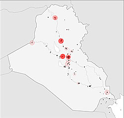
This animated map of coalition military fatalities during the Iraq war unfolds at ten frames per second. Each frame represents one day of the war. One dot marks each casualty site. A death begins as a white flash, then grows to a larger red dot, which turns black after 30 frames (days), fading at last to permanent grey.Almost like a Google Maps mashup. This gives you a new perspective as to how the fighting is occurring. Also makes your stomach a little upset as you realize what every sound effect you are hearing is representing.
via Boing Boing
![]()
![]()


 RSS Feed
No comments:
Post a Comment
Note: Only a member of this blog may post a comment.