The Misleading Nature of the Unemployment Statistic
Loyal Fat Knowledge reader and French blogger Laurent GUERBY (the auto-translate feature on Google Reader is pretty sweet by the way) makes a compelling case (translated version) that the unemployment statistic reported by BLS is worthless because of the growing number of "inactive" non-employed individuals that are not considered unemployed because they are not actively seeking work.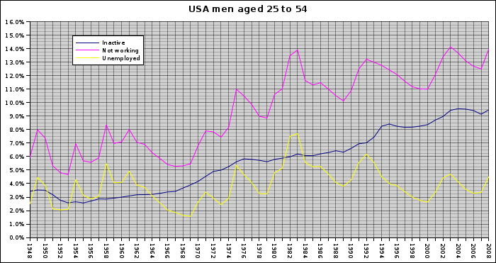
The yellow line shows the currently reported level of unemployment unemployed/total population (slightly different that the unemployment rate which is unemployed/labor force), the blue line shows the percentage of "inactive" workers (not in the work force) and the pink line is unemployed + inactive.
And even the pink line is too low as it only takes into account the Civilian noninstitutionalized population and ignores the 2.3 million people are in prison in the U.S. in 2007 (of which over 90% are men) which Laurent calculates would add another 2 to 3%.
One can only note that the number of inactive growing steadily from around 3% in 1948 to over 9% after 2003. The share of unemployed it hovered around its average over the period was 4%. The total number of unemployed remained below 8% until 1974 and then took off with three peaks to 14% in 1982, 2003 and 2008 never back down below 8%.One thing this graph makes me wonder about is the story that was told about the "new economy" in the late '90s that was able to have much lower levels of unemployment without inflation kicking in. The explanation was that this was due to greater productivity growth. But, looking at the pink line rather than the yellow one, I wonder if instead the issue was with how unemployment was being measured. That many people that were not considered "unemployed" were actually available, so employers could continue to hire without having to raise wages.
What is the situation of these men from 25 to 54 years in 2008 were unemployed and did not seek, or 8.7 million people?
The least we can say is that these figures yet available, not only to economists, after multiple requests from economists bloggers I returned empty-handed with exactly zero paper studying this phenomenon is massive probably a key to understanding the world of work after the Second World War.
David Leonhardt makes a similar case about the misleading nature of the unemployment statistic over at the NY Times.

The unemployment rate reached its highest point since 1993, and overall employment fell by more than a half million jobs. Yet that was just the beginning. Thanks to the vagaries of the way that the government’s best-known jobs statistics are calculated, they have overlooked many workers who have been deeply affected by the current recession.Further information on those without jobs that aren't unemployed, to understand whether they are stay-at-home parents, students, retirees or discouraged job seekers would be very helpful to understand why the number is rising.
The number of people out of the labor force — meaning that they were neither working nor looking for work and that the government did not consider them unemployed — jumped by 637,000 last month, the Labor Department said. The number of part-time workers who said they wanted full-time work — all counted as fully employed — rose by an additional 621,000.
Take these people into account, and the job market may be in its worst condition since the early 1980s. It is still deteriorating rapidly, too.
Such language may sound out of step with a jobless rate that, despite its recent rise, remains at 6.7 percent; the rate exceeded 10 percent in the early 1980s. But over the last few decades, the jobless rate has become a significantly less useful measure of the country’s economic health.
That is because far more people than in the past fall into the gray area of the labor market — not having a job and not looking for one, but interested in working. This group includes many former factory workers who have been unable to find new work that pays nearly as well and are unwilling to accept a job that pays much less. Some get by with help from disability payments, while others rely on their spouses’ paychecks.
The unemployment rate has been made less meaningful by the long-term rise in dropouts from the labor force. The simple percentage of people without jobs — including retirees, stay-at-home parents and discouraged would-be job seekers — can also be misleading, though. It has dropped in recent decades mainly because of the influx of women into the work force, not because the job market is fundamentally healthier than it used to be.
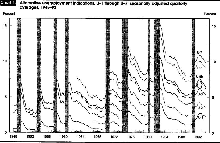
One alternative to the official unemployment statistic from the BLS is to use one of the other 5 unemployment statistics that the BLS releases. They now calculate 6 types of unemployment figures: U1-U6, with U3 being the official version. The higher versions add in discouraged workers and others that would like to work but aren't in the official unemployment number. This graph (source) shows how they have changed over the years.
The definition of unemployment is very important when comparing unemployment rates between countries. While the unemployment statistic make the US look to have much lower unemployment than Europe, if you look instead at employment rates of those 25-54 the US is almost identical to Europe (and surprisingly the US has a lower employment rate than "socialist" Sweden).
Update: This chart shows that the spread between U3 and U6 has greatly increased over the last year meaning that the level of underemployed people is growing much faster than the officially reported level of unemployment.
![]()
![]()


 RSS Feed
9 comments:
Thanks for this article!
A small detail: "The yellow line shows the currently reported level of unemployment". Yellow is unemployed/total population while the reported "unemployment" is unemployed/active population.
Thanks to census people I've added a more accurate estimation of people in jail, but still within my 2-3% estimate.
Laurent,
Thank you for writing your post and creating your chart. I think it is an important question to answer as to why the percentage of inactive workers has grown and hopefully you pushing the question will get it answered.
Thanks for the small detail on unemployment. I should have known that from the other post I did, but obviously I missed it. I have updated the post accordingly.
I've now sent the graph and data to 7 major english econ blog:
Calculated Risk, The Big Picture, Mish global economic analysis, Naked Capitalism, Matthew Yglesias, econbrowser, Interfluidity.
Zero response, zero blog post on this topic.
Laurent Guerby:
You forget Angry Bear, a rising star! of being ignored. I will forward to people at AB.
Got response from Calculated risk, John Quiggin and econbrowser. Any news from Angry Bear ?
Laurent - This is already well understood and has been covered on many of these blogs before. The notion of discouraged workers is not a revelation. Barry Rithotlz has covered the U6 in the past.
Numbers are always nice. I think there are many who agree with you, in general, that unemployment is being underreported. It's probably deliberate -- for political reasons (dare I say propaganda?).
Anonymous, the fact that the inactive population has such a trendline since 1948 has never been covered to my knowledge.
John Quiggin and econbroser pointed me to
http://www.econ.umd.edu/~duggan/JEP-Disability.pdf
My analysis of this paper:
However, after a first reading and if I did not misinterpret, the paper
looks at 1978-1998 period with 1984 as reference of a change in
legislation and ends up with a numerically low effect: 0.5% on
unemployment measure. Other factors are cited (like on my blog) but not
analyzed quantitatively.
If you look at the 1948-2008 data as I did you'll notice quickly
that 1960-1984 and 1984-2008 (to take an equal number of years
on both side while retaining the maximum data) see the exact same
increase in the inactive population, +3 points for the first period from
3% to 6% and then again +3 points from 6% to 9%, both in 24 years.
I of course don't have references on legislative changes related
to disabilities on the 1960-1984 period, but the data above
confirm that the 1984 change is very low impact, if not null
on the big picture of the inactive population evolution.
Angry Bear just posted on the topic, great!
http://angrybear.blogspot.com/2009/02/another-look-at-falling-participation.html
Laurent
Post a Comment
Note: Only a member of this blog may post a comment.